Showing posts with label Visual Journal. Show all posts

Monday, April 15, 2019

#97 - #102!!! I did it! I reached my goal of 100 pieces in 100 Days!

#96
This is another piece from when I was playing with aboriginal motifs. I really enjoy drawing with dots to create fluid movement or form or volume. It's surprising what they can do. The only problem with it is that drawing the dots or the small lines causes my hands to hurt more than I can tolerate. My massage therapist felt my hand after creating my pregnant nude (a 3-4 day process) and was stunned at how large and hard my hand felt.  And it HURT!  I went to bed in pain. Darn it! I don't know if there's a better way to do the dots and lines or not. I watched an aboriginal woman paint (leaves, not dots) and her lines were incredibly fluid and easeful.  I have a lot to learn before I can do that!


#97
In my Intermediate Drawing class the other day, I brought in some dogwood flowers and asked the students to draw them in as many different ways they could imagine, using lots of different materials.  I decided to take my own challenge.  #97 and #98 were my results. I find it helpful to challenge myself to draw the same thing many times - it kicks me out of my ingrained habits and ways of doing things and helps force me to have new ideas. The pencil drawing is my typical way of drawing a flower. It's what I know best (other than pastel) and gives me the most control.  The small black square-ish is done with a Sharpie marker and pencil. It was very different working smaller an trying to fit the flower into the small box. I faced the flower a different way as well, so it probably isn't as legible as a dogwood blossom. For that reason, it makes me a bit uncomfortable, but I also find it an interesting graphic. Overall, I like it more than I don't.

#98
#98. First I drew the flower in ink, lying face down on the table. I used the method of Modified Blind Contour Drawing, so mostly I wasn't looking at the paper as I drew, just at the flower (though I peeked enough to get it mostly accurate). Then I drew charcoal all over the paper and used my eraser to draw the larger flower in, right over top of the smaller flower. I used to never layer things. I wouldn't have put two different drawings on the same page. Now I don't really care. I didn't pay attention to the first flower when I drew the second. They end up interacting with each other. If I'd been more intentional about it, I would have changed the composition, but this one makes me think and work with it and try to decide if I like it or not, or what I could/should have done better. It's good to try new stuff. I never know if I'll end up liking something or not.

#99
Wysteria Vine from the Discomfort
Workshop


Yesterday I was beginning to panic a little bit because April 15 was rapidly approaching, and I didn't have any idea of how many pieces I had done and whether I was close to 100 or not.  To that end, I began playing in my visual journal, combining elements I'd been saving for a while. This picture has images from a flower catalog, a quote, and some paper I made Thursday morning.  That's another story...

I teach a group of women who've been working with me for about two and a half years now.  We began by having me teach them Zentangles. After a while, I got tired of Zentangles and wanted to expand what we did, so I began teaching them some elements of design and about color. Since that time, we have explored so much! We've researched artists and created artwork a la Artists XYZ. We will soon be starting on a series of women artists and their contributions over the centuries and today.

One of the women in the group is the one who loves to buy art supplies and brought me the Brusho to try out. She also provided a book by Elizabeth St. Hilaire who creates colorful papers using acrylics on rice paper, then tears up the paper to create collages. This students, Barbara, wanted to learn how to do it, and was thinking about going to Florida to take a workshop with the woman, but I told her, after looking at the book, that I thought I could figure out most of it.  So Thursday, we created part one of 8 of my version of St. Helaire's workshop!

We hauled 7 folding tables into my yard, covered them with plastic, then pulled out paints, water, cups, things with which to make textures, paintbrushes, stencils, and about 30 other fun things with which to paint/mark/scrape/etc. and for 4 hours proceeded to cover rice paper with as much paint and as many textures as we could muster.  It was a great deal of fun, and we came up with some really interesting papers.  Though we are meant to hold on to them to use for collaging, I have used a couple in my Visual Journal already today. In #100, the white paper is one of the sheets I made that day.  I used paint on corrugated cardboard along with some bubble wrap to create the textures you can see.  The green is simply brush strokes. I think it'll be fun to see what other papers we come up with and what we end up doing with it.  It's an interesting process to learn an to go wild with!
#100
#101
#101 is a collage out of many disparate elements. The card is an advertisement for a book of poetry published here in Richmond by a woman named Hope Whitby. 

#102
#102 is more flower catalog images along with a blind contour drawing.

AND - I CAN'T BELIEVE IT!! With this blog post I am finished with my 100 Creations in 100 Days! Warts and all!  And 2 days early. Wow.  Tomorrow I will take some time to reflect on how this feels and what I've learned from the whole process, but for now I need to go to bed. It's after 1 AM and I gotta get some sleep!

Thank you for taking the time to read my blog. I'm deeply honored that you have spent your time with me. If you feel like leaving comments, I always welcome them (as long as they're nice!)

Good night!


Saturday, April 13, 2019

#95: My student asked, so I figured, Why not? Experimenting with Brusho

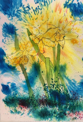
In March, one of my students who LOVES to buy art supplies, brought me some Brusho and asked me to play with it then show her how to use it.  I'd never heard of it so I did a little bit of research and began experimenting, using the beautiful jonquils just then blooming in our yard as my subject.

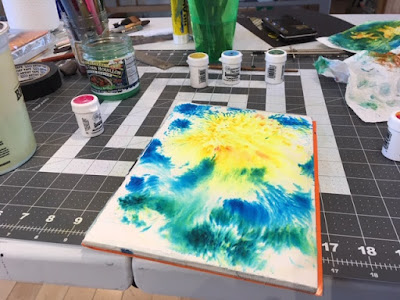
Brusho is a powder that comes in small containers. You're supposed to poke a hole into the top of the container so you can shake the powder out to put it on paper.  It's highly concentrated and very intense, so not much is needed.  It can be applied dry to dry paper which you then spray with water, or dry onto wet paper where it spreads on its own.  It spreads more or less, depending on how wet the paper is.  The first picture was done to give me a chance to understand a bit about how the Brusho reacts in general.  I discovered quickly that the colors are vibrant to the point of glaring. I like a bit more subtlety in my colors.

Below you can see the small jars of pigment and the start of a drawing.  I used pencil to draw the jonquils onto watercolor paper then wet the paper and sprinkled the appropriate color Brusho into the various areas.

 I then re-drew my drawing using a Micron 01 pen, a waterproof, very thin-line, permanent marker, to re-establish the flowers and foliage.
 I decided to try to deepen the background to make the jonquils stand out more, but decided it was too much. I didn't like the mess I'd made so I cut out the flowers and put them on a black background.
I wasn't so crazy about that either - the contrast was too stark - so I put it on a very different, weird background - the red and tan striped paper. I painted a plastic cup around the flowers and splashed a bit more Brusho around the flowers and called it done.


#95
Spring Flowers
Brusho, watercolor, collage, multimedia

#89 - #94: Visual Journal meanderings

Before leaving for Paris March 22, I was experimenting with lots of patterns in my Visual Journal.  Some of the designs I saw on Pinterest, some in a book about Aboriginal artists, some I made up. Inspiration comes from so many different places.

What I love about my Visual Journal is that it's my place to experiment.  I choose to ask myself, "I wonder what would happen if I...?" then I proceed to find out. Sometimes the results are wonderful, and I'm really happy. Other times I feel disappointed and feel like maybe I wasted my time - though I also realize that isn't true - I'm learning something at all times if I just pay attention to the lesson!

This first drawing gave me the idea to create the pregnant nude drawing using these same types of strokes to indicate the curves of her breasts and belly. The second drawing gave me more ideas about the roundness of her body and how to represent it.  (I've written about that drawing here.)


#90
#89

These drawings were created through the following process: First I painted the white paper with brightly colored, jewel-toned watercolors. After it dried completely (that part is important!), I put tape down where I wanted the paint to show. Then I painted the piece with black gesso. After it dried completely (again, completely is the operative word here!), I pulled up the paint to reveal the beautiful "frame".  Then I created the white-lined designed.

The piece on the left, I think, is less successful than the one on the right, primarily because I didn't follow my own advice and wait completely until the watercolor dried, or until the gesso dried! Consequently the watercolor isn't as finely done, and the lines aren't as sharp.  I also used lines to demarcate the regions. I prefer how I did it in the second one - I think it looks cooler! It's helpful to try things more than once to really get the hang of it better!

#91 Version 1
#92 Version 2

#93
"Art is something that makes me breathe with a different kind of happiness."
That seemed worth creating a pretty page for!

#94
I got myself some fancy gel pens and decided
to play with them to see what they were
capable of doing.  I enjoy drawing on black paper with
gel pens as the contrast is so satisfying!

Friday, April 12, 2019

#85 - #86: Sometimes it works; sometimes it doesn't. Oh well!

#85
This happened on a whim. A friend had some cheap liquid white acrylic paint. I was curious to learn what its coverage was like, so I painted with it on black paper in my journal. I really enjoy how the paint ran out unevenly towards the end of the paper.

I decided to play with the image so I did it again in red on white paper. The paper was unevenly cut and had some kind of stain on it. I changed the composition by playing with adding more lines. I've decided I prefer the black and white composition, but I can't learn what I like and can't expand my horizons if I don't try new things! My motto in working in my visual journal is "I wonder what would happen if I...?" That allows me to do whatever comes in my mind. In fact, that's a requirement! Sometimes the results are wonderful. Othertimes, they're questionable, but the process is always something I'm grateful for.

#86
#86 cropped

Monday, March 11, 2019

#53 - #58 of 100 Creations in 100 Days: Creativity Affirmations


February 24, 2019
I was in a bit of a funk, not clear about what I was doing creatively. I think most artists go there at least some of the time. When I started this blog, I thought I'd be very consistent, creating a large scale painting each day and posting it, writing about my process or the image each evening.

Life doesn't turn out the way you expect.  I know that. Yet it still comes as a surprise just about every time! 

I simply haven't had enough time to get into the studio as consistently as I'd like to, so those large paintings haven't happened - yet. Instead, I've been experimenting my visual journal and accepting that the drawing I'm doing as demos in class count as well for my self-challenge.  On this particular day, I wanted to offer encouragement to a friend whom I saw as needing creative encouragement, so I put together a book of quotes on creativity and started illustrating it. Before I was even half way through, I realized it wasn't for him - it was for me! I keep picking up the book and dipping in to read the quotes at the start of the day. It never hurts to get a bit of inspiration from someone else's wisdom. 

Below I've attached several of the pages and will attach others in tomorrow's and the next day's posts to provide you with a bit of affirmation for your creative journey if you need it too!

(By the way, if you're interested in spending 3 hours a day for a week playing in your visual journal, I'll be teaching just such a class at the Visual Arts Center of Richmond, June 17-21, 1:30 - 4:30 daily, Monday - Friday.  It isn't on their website yet, so if you're interested, you can contact me to ask me to tell you when it is, or take a look in May and sign up then.)


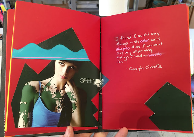
#53 "I found I could say things with color and shapes that I couldn't say any other way, things I had no words for."
~ Georgia O'Keeffe

#54 "The artist must train not only her eye, but also her soul."
~Wassily Kandinsky
(I might have changed pronouns here just a bit!)

#55 "One can speak poetry just by arranging colors well."
~Vincent VanGogh
~image by Chihuly

#56 "an artist is an explorer"
~Henri Matisse

#57 "The artist produces for the Liberation of her soul.  It is
her nature to create as it is the nature of water to run down the hill."
~Author Unknown
(I may have changed these pronouns too!)

#58 "Color is the place where our Brains and the Universe meet."
~Paul Klee

Tuesday, February 26, 2019

#41, #42, #43 of 100 Creations in 100 Days. Aboriginal Designs and CitraSolv Papers


#41
As a child, I spent a lot of time doodling in my notebooks while also taking notes.  I had certain doodles I always went back to, like drawing flowers, or creating auras around objects, like words written in "bubble script". Recently I was browsing the work of aboriginal artists from Australia and found ones that reminded me of the doodles I used to do so I  decided to use them as the basis of some new work.  These two pieces are the result. They are both done on black paper using a white (and gold) gel pen.


#42
The paper that both have in common is a paper I purchased, not something I drew.  I just liked the juxtaposition of one to the other.

#43


This third piece is done on a page from a National Geographic which was treated with Citrasolv.  Citrasolv makes the ink dissolve, sometimes completely, sometimes just a bit. This page was primarily text with a block of image. The ink hadn't completley dissipated so I played with the patches where is was lighter and darker, creating auras around each light patch, then coloring in some of the curves created from that patterning. I plan to play with this technique some more.  It was enjoyable to create and I like the results.


Monday, February 25, 2019

#37, #38, #39, #40 of 100 Creations in 100 Days: Visual Journal entries, memorial to Lisa Fisher Johnson

Feb 7, 2019 was all about teaching and playing in my visual journal.  There are times when I don't have the energy to stand and work at the easel and I don't have any big ideas. That's when I pull out my journal and let myself riff on ideas that have been rolling around in my head for a while.  It's easeful and relaxing and generally satisfying.  It's about process, not product.  It's so good for me to move away from a product orientation because I generally don't let myself play and try new things enough.

Before I got into the studio, I taught my "Zentangle Ladies". They're a group of women to whom I was initially teaching Zentangles, but the group has morphed into a lovely amalgam of friends who do art together.  Right now I'm teaching them the Fundamentals of Drawing.  The first lesson I always teach is Blind Contour Drawing.  One of the more advanced lessons with Blind Contour is having them draw the person sitting across from them.  This drawing is by one of my students, Barbara.  I posted it because I absolutely love it!  It's funky and fun and weird and wacky and wonderful!  And it even captures the essence of the woman it's of.  It excites me when my students make such fun work!
Once my wonderful students left, I went out to the studio to play.  I worked with circles and Citrasolv and photos and whatever else was on my table. When we were in Wintergreen a few weeks ago, I began the picture on the left with all the intersecting circles.  It's based on fabric created by Knoll. 

I had the idea to take a page from a National Geographic magazine which I had doused in Citrasolv (it makes fascinating textures as you can see on the right hand piece) and cut circles out of it in the pattern of the piece on the left, then to glue it around the circles drawn there.  That didn't work well because I simply wasn't precise enough, but it did give me a lot of cool circles - and another idea!  The piece on the right was the result of those experiments. (The software for Blogger is again making me crazy!  I can't get the B&W ink drawing to stay next to the Citrasolv Circles, so the layout looks shabby.  Apologies!)

#38 Citrasolv Circles
#37 ink drawing based on fabric
design by Knoll

#39 Collage, photographs, calligraphy, citrasolv page
#39 I've been working with images of my husband Chris for a while.  I took a series of pictures of him to use in a David Hockney-type portrait collage.  I didn't end up creating that, but I have used the pictures to weave with, and, on this day, I used them to illustrate the quote "Art should disturb the comfortable and comfort the disturbed."

January 26th, my esteemed colleague and dear friend Lisa Fisher Johnson passed away. She had had a brain tumor. She was an amazing artist and one of the kindest, friendliest people I've ever known.  She was a marvelous person and a good friend.  I will miss her terribly.  I attended her memorial service and the reception afterwards where I was hoping to talk to people and to share my memories and grief, but I ended up feeling a bit too shy to approach people to talk.  I left early and came home and created my own memorial to Lisa, these pages, where I wrote about my feelings and thought about how dear she was to me.  Art can be so healing.

#40 Memorial to Lisa Fisher Johnson

Tuesday, January 22, 2019

#19 of 100 Creations in 100 Days: Dettifoss Waterfall

When Chris and I were in Iceland in October, we decided to drive to Dettifoss Waterfall because it reportedly has the greatest volume of any waterfall in Europe, 500 cubic metres of water per second plunges over the edge. Sure enough, it was deafening and impressive!

The drive to Dettifoss on icy roads
The drive to the site was long and arduous as the roads were icy, and it was beginning to get towards sundown. I wasn't sure we'd make it with enough daylight to see the place!  Chris was concerned we would have to walk some distance to get to where we could see the falls - I didn't think that was the case because most tourist sites make it easy for tourists to get to the good places!  I was wrong!  

Me, happy in my crampons!
When we got there, the parking lot was emptying out.  We headed to the trail.  Immediately I began slipping and sliding even though I had my great hiking boots on.  I asked people coming off the trail what it was like and how far it was to the waterfall - treacherous the whole way and over 1/4 mile.  Oops!  Thank goodness I had my crampons in the car and Chris was generous enough to go get them for me because I was slipping every step of the way - I don't know what kept him upright - great balance, perhaps?  He had no crampons at that point.  
My glorious crampons!  Like bears'
teeth. A wonderful invention!

Once I had my fabulous crampons on, I could walk over the ice beautifully!  They have teeth like a bear trap so they dug into the ice with every step and kept me from falling really well.  Note:  if you decide to go to Iceland in the winter, get/take crampons!  

The "trail" to Dettifoss
The walk was still arduous.  The trail wasn't clear and obvious - rather, we could tell where people had gone before because the snow was better packed down and in some places there were ropes showing us where not to go.  The terrain was rocky, full of ancient rhyolite volcanic boulders and debris.

Once we got to the waterfall, I was disappointingly underwhelmed.  It was, to be sure, massive - and LOUD!  So much water!  Therefore impressive.  But not beautiful.  There wasn't much light and the water appeared very muddy, not the fabulous white of other falls I'd seen.  Perhaps it was so turgid, it was grey and brown instead of white - I don't know.  Or perhaps I was tired and couldn't see the beauty. A friend of mine posted a beautiful picture of it from a different observation point from the summer and it looked gorgeous, so clearly it has a lot to offer which I didn't see this time around!
Dettifoss Waterfall (for scale, note the size of the posts and ropes of the trail markers)
And here's the artwork I created in response to our trip to Dettifoss.  The CitruSolve papers provided the perfect texture for me to express the flow of the water and the challenge of walking on the ice and the challenging rhyolite rocks.  The image of the falls themselves is from a postcard I bought in the area.  It gives a better sense of the actual color of the water than my picture since there wasn't much light left when we were there!
#19 Response to Dettifoss

Playing with Acrylics and Stencils and Gelli Plates and Rice Paper and... and... and...!

One of the joys of being a teacher is that I get to learn so much from my students... For the last couple of years I've been working w...