Marla Baggetta was brought to Richmond by the MidAtlantic Pastel Society, MAPS, a group anyone with interest may join (I highly recommend it!) Marla was an excellent teacher - fun, enthusiastic, caring, knowledgeable, with a whole stack of interesting and challenging exercises which really got her point across. Interestingly, she taught the very same concepts I teach in my Intro to Pastels class, but she had different exercises to get the point across, more advanced ones.
One of the first exercises we did was to draw an apple. I have my students draw apples as well, so it's an exercise I've done probably 200 times. It was fun to see her approach and to modify mine accordingly. She drew her larger and used much lighter, larger strokes than I do, not necessarily rounded to show the form of the fruit. I encourage my students to use strokes that go around the apple to help give a sense of form and volume. She also barely looked at the apple, just making up a lot of it including the light source. It was fun watching her delight in creating. She really loves to draw! I loved seeing that!
I drew four apples because I wanted to keep testing myself to do something new - a new view of the apple, using completely different colors and values - anything to test myself. The first one is fairly normal. These are about 9"x 12".

 |
| Very frowsy edges! |
 |
| The bottom of the apple. Very intense colors. Marla suggested that I got a bit heavy-handed with the pastel so I tried again! |
 |
| The fourth and final apple, also upside down. (Chris thought it was a picture of mountains and sky.) More muted colors. |
My favorite exercise had us consider composition and the values found in a given composition. We were to analyze the composition and break it up into 3-5 values, then draw that thumbnail according to Carlson's Theory of Angles/Planes (The link is to Marla's video explaining the theory in more detail than I have here.) which says that the values of elements in the landscape ascend from lightest to darkest in the following order:
- arch of sky - lightest, source of light
- ground plane (except water which may reflect the sky and be equally light)
- angled planes (like mountains)
- uprights - trees, etc.
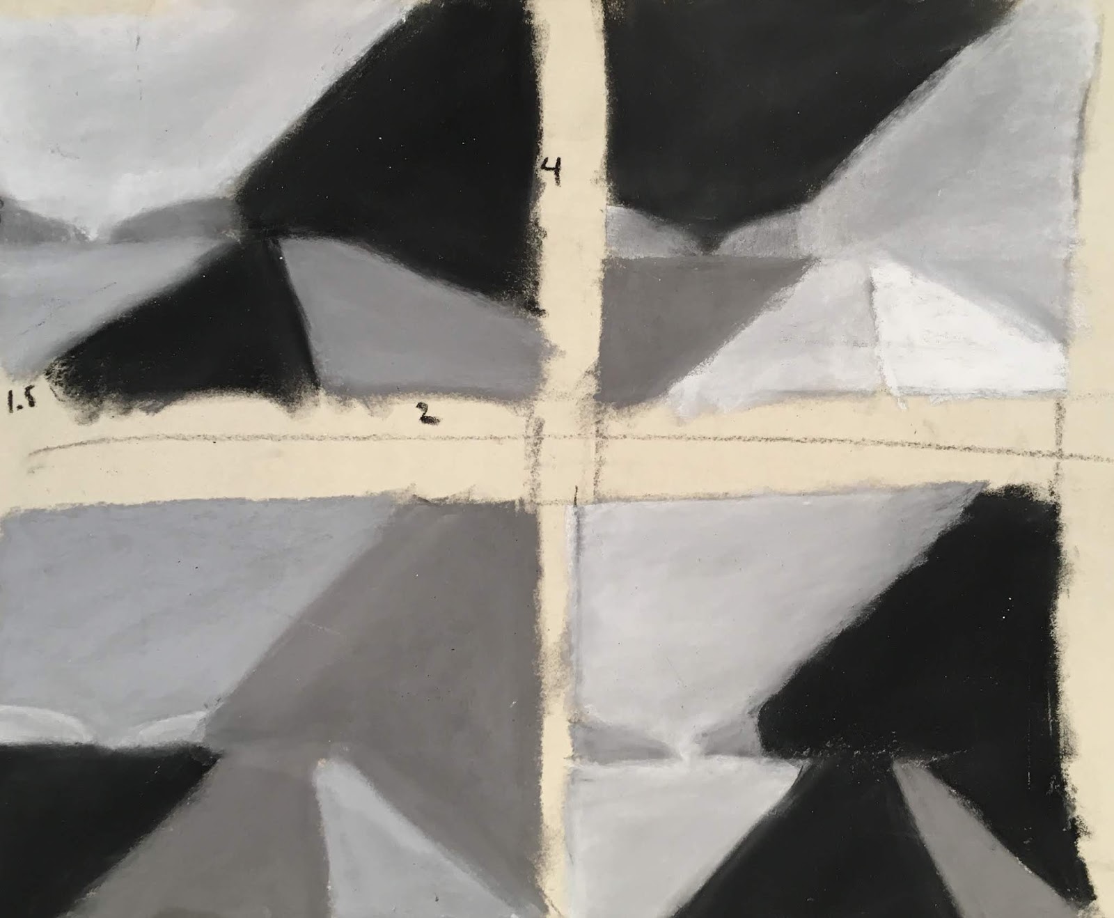
Once we drew our thumbnail according to this theory, we were to mix up the values and draw the thumbnail three more times using different values for each portion.
Once done, we were to use different color schemes to draw the thumbnail:
- B&W&gray
- realistic
- saturated (intense colors)
- neutral
- tints
- shades

After this lesson, Marla showed us a composition she had created out of thin air which she has drawn hundreds upon hundreds of times using these ideas. She did a demo to show us how she goes about using these ideas and incorporating them into a painting. Then she challenged us to use the exact same composition and our own color/value/intensity choices to create a piece. I did two.


I thought of Spring colors when creating this one. I haven't sorted out the difference between "loose" and "fast" - too much programming from my youth, I suppose, when "fast" and "loose" were synonymous for girls! Anyway, I did both of these very very quickly. I'd like to learn to work more slowly and thoughtfully AND loosely. I like the strokes here and the colors. I think I could have made it a bit stronger if I'd given it more thought as I went along. I will say, though, it was very fun tumbling along around the page, throwing colors at it without a photo reference. Very freeing!
Our next exercise was to use our own photograph, the one we had made the thumbnail for and worked with extensively. Here's the way my thumbnail developed (we were asked to create a vertical, a horizontal, and a square thumbnail for the image, but I only did horizontal and square (the third image is for a different image I hope to work on tomorrow):

That turned into the B&W and grey images show first in this blog post.
My first attempt at drawing this image wasn't as successful as I'd hoped: (oh! It feels so vulnerable to share this and to share my efforts. It seems so much safer to share just my final outcome after I'd done it three times!)

I like the water and sky, but the mistake I made was to try to draw the vertical trees AFTER the sky was in. It isn't possible to get the trunks dark enough. Marla came around and suggested I draw the tree trunks before drawing the sky then drawing the sky around the trunks and branches. I'd thought that would look weird and not so good, but she showed me how she does it, and I can see that it works. So here's the second attempt:

I feel like the foliage in the trees on the right is a bit heavy-handed so I decided to try it again, this time as a square composition:

I feel like I manage to convey the sense of the rising sun better in this one, and the foliage on the right is effective. I also like the light on the road. However, the brush on the left is too high, darn it. I do, however, like that I used lots of colors in the brush and trees, making it much more interesting. I will try it one more time tomorrow to see if I can nail this puppy! I'm not sure why it matters so much to me - I guess I just want to learn how to create a scene like this. It's difficult! I won't learn it unless I keep practicing. Stay tuned!
 The third day we had the opportunity to draw some pictures on our own using the information we'd learned the previous two days. I worked on one piece from Iceland, one from the James River. I did thumbnails of several images then chose these two as the most successful to try. There are a couple more I hope to draw this week when I get enough time to play again.
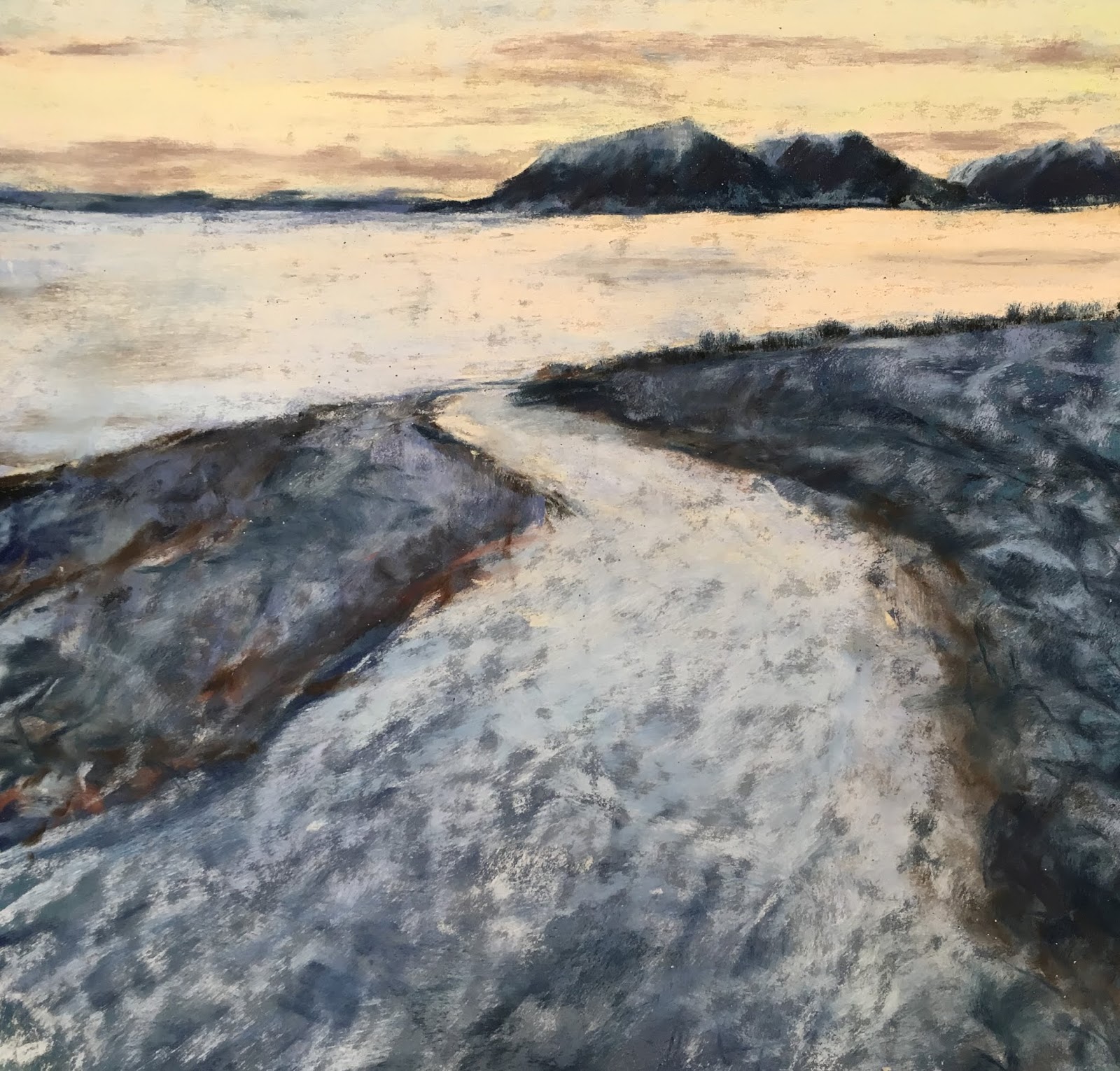 |
| Rounding the Bend, Hrisey |
 |
| Man and Nature Huguenot Bridge from Huguenot Flatwater |
The last exercise Marla challenged us with was to take the largest piece of paper we brought with us (mine was 19"x24") and to draw a single object from around the room on it, loose, fun. I almost got finished before the critique started!

I'm so glad I took this workshop. It was great being with a group of pastelists who are serious about their craft and already are quite skilled. And working with Marla was a true gift. I feel like I learned a lot which I will use in my work from here on out - now, finally - maybe! - I can loosen up and let the energy I'm feeling come through more clearly!


No comments:
Post a Comment