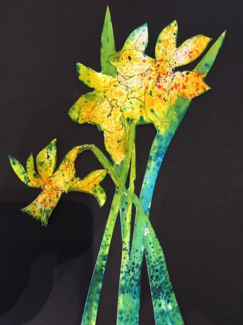
Friday, April 19, 2019

After the 100 Days were Gone By

Left with the void from having completed 100 Creations in 100 Days, I wasn't sure what to do. For about a nanosecond! As soon as I gave myself a chance to wonder, I knew I wanted to paint a pastel painting from Iceland.

My husband and I have just bought plane tickets for Iceland for October.  He'll be there a week. I'll be staying about 35 days, doing another Artist's Residency. I just don't want to stay away from this beautiful country!

We will be in Laugarvatn at Gullkistan Residency, one we have both done before. Laugarvatn is a beautiful small town on the Golden Circle (between Thingvellir and Geysir). There's a gorgeous lake with fabulous clouds scudding across the sky in front of the plate glass windows of the residency's studios. There is a large hotel where I've taken my travelers on our tours and a hostel. Three schools. Some good restaurants. A terrible grocery store that's more like a convenience store. A luxury spa. A swimming pool with practically the same facilities but only $5, not $35. And a lake - did I mention the lake? - to walk down to daily and wander around. And a mountain with trails behind the residency to climb and explore.  It's a compact paradise near many wonderful sights. I am very excited about returning yet again.  I feel so blessed!

So I looked through my photographs of Iceland, ones I'd stored in the special folder on my desktop marked "Paint these", and chose one from a day in Akureyri.  I'd needed to get away from the hustle and bustle of the city so I drove south down the fjord, away from town. Across the fjord I was startled by the contrast between the bright white mountains and the crystal blue sky. With the gentle half moon perched gracefully near the floating white clouds. It's now a painting on my easel where I look daily with longing, anticipating a return to this land I love so much!

Half Moon
pastel
24"x18"
$650


Monday, April 15, 2019

#97 - #102!!! I did it! I reached my goal of 100 pieces in 100 Days!

#96
This is another piece from when I was playing with aboriginal motifs. I really enjoy drawing with dots to create fluid movement or form or volume. It's surprising what they can do. The only problem with it is that drawing the dots or the small lines causes my hands to hurt more than I can tolerate. My massage therapist felt my hand after creating my pregnant nude (a 3-4 day process) and was stunned at how large and hard my hand felt.  And it HURT!  I went to bed in pain. Darn it! I don't know if there's a better way to do the dots and lines or not. I watched an aboriginal woman paint (leaves, not dots) and her lines were incredibly fluid and easeful.  I have a lot to learn before I can do that!


#97
In my Intermediate Drawing class the other day, I brought in some dogwood flowers and asked the students to draw them in as many different ways they could imagine, using lots of different materials.  I decided to take my own challenge.  #97 and #98 were my results. I find it helpful to challenge myself to draw the same thing many times - it kicks me out of my ingrained habits and ways of doing things and helps force me to have new ideas. The pencil drawing is my typical way of drawing a flower. It's what I know best (other than pastel) and gives me the most control.  The small black square-ish is done with a Sharpie marker and pencil. It was very different working smaller an trying to fit the flower into the small box. I faced the flower a different way as well, so it probably isn't as legible as a dogwood blossom. For that reason, it makes me a bit uncomfortable, but I also find it an interesting graphic. Overall, I like it more than I don't.

#98
#98. First I drew the flower in ink, lying face down on the table. I used the method of Modified Blind Contour Drawing, so mostly I wasn't looking at the paper as I drew, just at the flower (though I peeked enough to get it mostly accurate). Then I drew charcoal all over the paper and used my eraser to draw the larger flower in, right over top of the smaller flower. I used to never layer things. I wouldn't have put two different drawings on the same page. Now I don't really care. I didn't pay attention to the first flower when I drew the second. They end up interacting with each other. If I'd been more intentional about it, I would have changed the composition, but this one makes me think and work with it and try to decide if I like it or not, or what I could/should have done better. It's good to try new stuff. I never know if I'll end up liking something or not.

#99
Wysteria Vine from the Discomfort
Workshop


Yesterday I was beginning to panic a little bit because April 15 was rapidly approaching, and I didn't have any idea of how many pieces I had done and whether I was close to 100 or not.  To that end, I began playing in my visual journal, combining elements I'd been saving for a while. This picture has images from a flower catalog, a quote, and some paper I made Thursday morning.  That's another story...

I teach a group of women who've been working with me for about two and a half years now.  We began by having me teach them Zentangles. After a while, I got tired of Zentangles and wanted to expand what we did, so I began teaching them some elements of design and about color. Since that time, we have explored so much! We've researched artists and created artwork a la Artists XYZ. We will soon be starting on a series of women artists and their contributions over the centuries and today.

One of the women in the group is the one who loves to buy art supplies and brought me the Brusho to try out. She also provided a book by Elizabeth St. Hilaire who creates colorful papers using acrylics on rice paper, then tears up the paper to create collages. This students, Barbara, wanted to learn how to do it, and was thinking about going to Florida to take a workshop with the woman, but I told her, after looking at the book, that I thought I could figure out most of it.  So Thursday, we created part one of 8 of my version of St. Helaire's workshop!

We hauled 7 folding tables into my yard, covered them with plastic, then pulled out paints, water, cups, things with which to make textures, paintbrushes, stencils, and about 30 other fun things with which to paint/mark/scrape/etc. and for 4 hours proceeded to cover rice paper with as much paint and as many textures as we could muster.  It was a great deal of fun, and we came up with some really interesting papers.  Though we are meant to hold on to them to use for collaging, I have used a couple in my Visual Journal already today. In #100, the white paper is one of the sheets I made that day.  I used paint on corrugated cardboard along with some bubble wrap to create the textures you can see.  The green is simply brush strokes. I think it'll be fun to see what other papers we come up with and what we end up doing with it.  It's an interesting process to learn an to go wild with!
#100
#101
#101 is a collage out of many disparate elements. The card is an advertisement for a book of poetry published here in Richmond by a woman named Hope Whitby. 

#102
#102 is more flower catalog images along with a blind contour drawing.

AND - I CAN'T BELIEVE IT!! With this blog post I am finished with my 100 Creations in 100 Days! Warts and all!  And 2 days early. Wow.  Tomorrow I will take some time to reflect on how this feels and what I've learned from the whole process, but for now I need to go to bed. It's after 1 AM and I gotta get some sleep!

Thank you for taking the time to read my blog. I'm deeply honored that you have spent your time with me. If you feel like leaving comments, I always welcome them (as long as they're nice!)

Good night!


Saturday, April 13, 2019

#95: My student asked, so I figured, Why not? Experimenting with Brusho

In March, one of my students who LOVES to buy art supplies, brought me some Brusho and asked me to play with it then show her how to use it.  I'd never heard of it so I did a little bit of research and began experimenting, using the beautiful jonquils just then blooming in our yard as my subject.

Brusho is a powder that comes in small containers. You're supposed to poke a hole into the top of the container so you can shake the powder out to put it on paper.  It's highly concentrated and very intense, so not much is needed.  It can be applied dry to dry paper which you then spray with water, or dry onto wet paper where it spreads on its own.  It spreads more or less, depending on how wet the paper is.  The first picture was done to give me a chance to understand a bit about how the Brusho reacts in general.  I discovered quickly that the colors are vibrant to the point of glaring. I like a bit more subtlety in my colors.

Below you can see the small jars of pigment and the start of a drawing.  I used pencil to draw the jonquils onto watercolor paper then wet the paper and sprinkled the appropriate color Brusho into the various areas.

 I then re-drew my drawing using a Micron 01 pen, a waterproof, very thin-line, permanent marker, to re-establish the flowers and foliage.
 I decided to try to deepen the background to make the jonquils stand out more, but decided it was too much. I didn't like the mess I'd made so I cut out the flowers and put them on a black background.
I wasn't so crazy about that either - the contrast was too stark - so I put it on a very different, weird background - the red and tan striped paper. I painted a plastic cup around the flowers and splashed a bit more Brusho around the flowers and called it done.


#95
Spring Flowers
Brusho, watercolor, collage, multimedia

#89 - #94: Visual Journal meanderings

Before leaving for Paris March 22, I was experimenting with lots of patterns in my Visual Journal.  Some of the designs I saw on Pinterest, some in a book about Aboriginal artists, some I made up. Inspiration comes from so many different places.

What I love about my Visual Journal is that it's my place to experiment.  I choose to ask myself, "I wonder what would happen if I...?" then I proceed to find out. Sometimes the results are wonderful, and I'm really happy. Other times I feel disappointed and feel like maybe I wasted my time - though I also realize that isn't true - I'm learning something at all times if I just pay attention to the lesson!

This first drawing gave me the idea to create the pregnant nude drawing using these same types of strokes to indicate the curves of her breasts and belly. The second drawing gave me more ideas about the roundness of her body and how to represent it.  (I've written about that drawing here.)


#90
#89

These drawings were created through the following process: First I painted the white paper with brightly colored, jewel-toned watercolors. After it dried completely (that part is important!), I put tape down where I wanted the paint to show. Then I painted the piece with black gesso. After it dried completely (again, completely is the operative word here!), I pulled up the paint to reveal the beautiful "frame".  Then I created the white-lined designed.

The piece on the left, I think, is less successful than the one on the right, primarily because I didn't follow my own advice and wait completely until the watercolor dried, or until the gesso dried! Consequently the watercolor isn't as finely done, and the lines aren't as sharp.  I also used lines to demarcate the regions. I prefer how I did it in the second one - I think it looks cooler! It's helpful to try things more than once to really get the hang of it better!

#91 Version 1
#92 Version 2

#93
"Art is something that makes me breathe with a different kind of happiness."
That seemed worth creating a pretty page for!

#94
I got myself some fancy gel pens and decided
to play with them to see what they were
capable of doing.  I enjoy drawing on black paper with
gel pens as the contrast is so satisfying!

#88: Waiter's Disapproval turns to Waiter's Delight through Art

In Paris, the City of Light, thanks to my friends' predilection for coffee, we spent a fair amount of time sitting in cafe's, watching the people go by, enjoying a rest from all the activity. I don't drink coffee, and I tend to push myself quite a lot and to forget to rest, so sitting in a cafe was different for me! Not bad at all - just different!

After going to a fabulous market near the Bastille our second day in the city, it was definitely time to take a load off our feet, so we went to a crowded cafe nearby. Karen and Gerlinde ordered coffee.  I asked for water. The waiter told me that wouldn't work - I needed to consume something.  I shrugged and figured he just wouldn't bring me anything. I'd sit and enjoy the company. 

A few minutes later, he did bring me water and was fairly nice about it, though he didn't put it down with a flourish.

I took out my sketchpad, watercolors, and brushes, and began to paint the scene in front of me. To my delight, Karen and Gerlinde did the same.  It felt like a dream come true - sitting in a cafe in Paris, sketching the scene before me.  I was tickled to bits!

The cafe had red chairs, red tables, red cups, and we had coincidentally bought red anenomes at the market to put in our apartment to brighten it up. I really enjoyed painting the bright red elements.

The waiter returned about 30 minutes later and saw I was using the water he'd brought to wash my brush out with. Suddenly he was totally delighted! He grinned and mimicked posing and asked me to paint his picture, "The Waiter"! I'd worried he might be pissed I was misusing their glass, so it made me really happy that he was thrilled and played along so well.  It made me think of the days when Paris was the center of the art world and starving artists paid their bills at the cafes and restaurants by drawing pictures on napkins and placemats for the propietors who quasi-supported them. It was very fun being a part of that for a brief fantasy-rich moment!

#88, Waiter's Delight
Watercolor
6"x9"

Paris, City of Light, near sunset.

Sainte Chappele, my favorite building in Paris, in the evening as night falls,
as we prepare to listen to a concert of Baroque setting in the most
beautiful setting imaginable.

Friday, April 12, 2019

#87: Monet's famous Japanese bridge. Not my most successful product, but fabulously wonderful process!

When Gerlinde, Karen, and I went to Paris in March, we decided to take a daytrip to Claude Monet's most fabulous creation - his home an garden in Giverny. It was a perfect blue-sky Spring day with a touch of coolness in the air with the plants just beginning to send out shoots, leaves, and flowers. The site had only been opened for 2 days so far this season so there were very few visitors. We had the place almost to ourselves - well, relatively speaking! That famous Japanese bridge was only very rarely free of people taking selfies or having others photograph them (I'm definitely included in that number!)
I love the way the trim all around the room, and
 even on the furniture is painted a darker color.
I don't know that I would be so bold!
(I also don't have such ornate,
beautiful trim!)
The yellow dining room. Everything was yellow other than the
floor! There were also different shades of yellow here, like
in the blue room, but they were less noticeable here.
This felt very much like a room for a large family.  I could
almost hear their voices echoing off the walls.  (He had 2
children, his second wife brought 6 into the marriage - BIG
family!)
The kitchen! Blue tiles. Huge stove. Large room. I covet his
kitchen!
I also want these pots, shiny
copper bottoms all lined up in size
order. So beautiful!!
We toured Monet's fabulous, huge studio where he painted the gigantic water lily series which he donated to the French state and which can be found installed at l'Orangerie. Then we went to his house - what a fabulous home! It was nothing short of inspiring to see how he chose to decorate it - very bright and colorful rooms full of light and art. He collected Japanese prints and had them hung in many of the rooms on all the walls.  Of course, he also hung his own works, as well as those of his friends.  The ones hung there now are copies, but it gives the feel for how it would have looked with his works in progress and finished works all over the house.  
Gerlinde and I are standing by his bedroom window by his
desk. There is a simliar window by his bed. He awoke to
this view each day he was home and died in this room, with
this view just outside.  That sounds pretty close to heaven
already.
Karen was nice enough to take a picture
of me pretending to paint at Monet's
easel. That was heady stuff!  I WISH!!
The views from the rooms were stunning! They all looked out onto his gardens which were his other creations. I'd read about his gardens and had looked at pictures in books, but I never got a sense of how they were laid out. It was wonderful seeing them!

A boat just like this shows up in many of
Monet's paintings.  It was so easy to imagine
him here painting. Glorious!
This small creek wound grace-
fully beside the larger pond.
To try to give you a sense of it: you can see his house at the top of this post. Behind the house is the lane that goes through the village. I didn't notice any windows at all looking onto the lane. All the windows are directed towards the gardens. The formal, symmetrical gardens with many trellises for hanging roses, wysteria, etc. are directly in front of the house. They extend maybe 50 yards.
Part of the garden in front of his house
 Then there is a high wall.  We were directed to the right where there is a tunnel that goes under the road and emerges into the second garden, a much less formal one, where the pond is. There the plants appear less formally planted, but I have a feeling that they are every bit as carefully placed. Weeping willows, wysteria hanging from the famous bridge, azaleas, rhododendrons, bushes, shrubs, tulips and other seasonal blooming flowers, and, of course, the water lilies (which weren't yet in bloom when we were there).  There is a path all the way around the pond along with several secondary paths which branch off from and lead back to the primary path. The views from each aspect were stunning and made me want to stay for months painting, drawing, gazing, absorbing.

I am aware that the house and gardens have both been refurbished since Monet's time, and I believe the pond has even been enlarged, so they may not be completely faithful to his times, but I think there were great efforts made to be true.  I'm so glad we went!  It was a wonderful day with perfect weather!

Portender of what's to come!


After we had gone all the way around the pond, we decided to rest for a moment on one of the benches set there for just that purpose. I couldn't help myself - I got out my watercolors and journal and began to paint! The scene was too gorgeous to NOT at least try to paint. Gerlinde did the same. Karen served as cheerleader and photographer for our process.  For the next hour or more, we sat in the perfect sunshine and drew arguably the most famous artist's garden in the world.  As I worked, I felt very good about my art, enjoyed what I was doing, liked my results.  When I was finished, I felt chagrinned - it hadn't turned out as well as I wanted it to.  I made excuses - I'm not good at plein air, watercolor isn't my medium - I can't do it very well, I needed more time. I could have done it better in pastels, especially from a photo.  Any and all of that may be true, but, really, it just doesn't matter.  I had a wonderful time working on the piece. It was very fun when people came by and commented. It filled my heart with joy to create in Monet's garden. Period. Full stop.  The results just aren't that important.  (Though, honestly, I do wish they were better!)


When I got home from Paris, I found out from my brother that he and my mother had been to Giverny together quite some years ago. They actually sat in the exact same place and also painted!  When I visited my mother last week, she showed me the painting she did there. THAT was what I'd wanted mine to look like!  Mom is one of the best watercolorists I know.  It was great seeing her version of what I'd tried so hard to capture! Maybe one day she and I will go back there and she'll show me how to do watercolor like a pro like she does!
#87
My version of the famous Japanese bridge, 3/2019


and my mother's beautiful painting from 2004.
Watercolor by Emma Lou Marchant Martin.

#85 - #86: Sometimes it works; sometimes it doesn't. Oh well!

#85
This happened on a whim. A friend had some cheap liquid white acrylic paint. I was curious to learn what its coverage was like, so I painted with it on black paper in my journal. I really enjoy how the paint ran out unevenly towards the end of the paper.

I decided to play with the image so I did it again in red on white paper. The paper was unevenly cut and had some kind of stain on it. I changed the composition by playing with adding more lines. I've decided I prefer the black and white composition, but I can't learn what I like and can't expand my horizons if I don't try new things! My motto in working in my visual journal is "I wonder what would happen if I...?" That allows me to do whatever comes in my mind. In fact, that's a requirement! Sometimes the results are wonderful. Othertimes, they're questionable, but the process is always something I'm grateful for.

#86
#86 cropped

#80 - #84 of 100 Creations in 100 Days: Drawings from Teaching Drawing

One of the things I appreciate about teaching drawing is that, occasionally, I also get to draw!  Sometimes I draw as a demo for students. Other times I draw while they do. Either way, it's such a pleasure to feel my pencil glide across the paper, to see the image evolve, to find the darks and lights. I love working with color, but drawing in graphite was my first love and still has my heart every time I do it.

#81
The exercise for the pears was a chance for students to pull together everything they'd learned in class up to that point - volume, line, value, shadow, and more - and put it into one picture - no pressure! I find they seem to be glad to work for an hour or more on a picture with no pressure to rush - just the delight and absorbing pleasure of working until they feel finished.
#80
And then there are the still lifes... When I was in school, I found these so boring - such stupid items placed together in such dumb ways - what was the point?! Now as a teacher, I have a different understanding - it helps students tackle composition and complicated images. It's a chance to work on the relationships between items and to draw difficult objects like glass and to practice creating form using value. Now I kinda like doing them.
#82
#83

One of the exercises I give my students in Intermediate Drawing is to bring in a single object which is rather complicated. Then I give them the assignment to draw it at least 10 times in 10 different ways (using gesture, blind contour, modified blind contour, super-sized, 1" small, etc.) using different materials each time - pencil, charcoal, peelable charcoal, pen, etc. It tends to be a challenging exercise as it stretches a student's ability to think of different ways to approach the same subject and to keep it interesting.  Below is my drawing of our wire cutters.
#84


Playing with Acrylics and Stencils and Gelli Plates and Rice Paper and... and... and...!

One of the joys of being a teacher is that I get to learn so much from my students... For the last couple of years I've been working w...