Monday, May 6, 2019

Playing with Acrylics and Stencils and Gelli Plates and Rice Paper and... and... and...!

One of the joys of being a teacher is that I get to learn so much from my students...

For the last couple of years I've been working with a group of five women who asked me to teach them how to do Zentangles.  We worked with Zentangles extensively for about a year then I began to feel I might have reached the limit of what I could teach them about Zentangles and started trying to bring in some other concepts and exercises.  They got right on board and began bringing me things they wanted to learn.  In this way, we have ranged all over the place from book making to drawing to paint pouring, etc.  We have traveled to the beach for a week and Wintergreen for the weekend, becoming dear friends along the way. I feel utterly blessed to have them in my life. We are a goofy group of very unique women who somehow manage to get along - probably because we accept each others' eccentricities with an indulgent smile, knowing they will accept ours too without judgment.  It's quite extraordinary!

But I digress...

A few months ago at Wintergreen, Barbara told us about an artist named Elizabeth St. Hilaire whose work Barbara is bananas about. We talked about having Elizabeth come up here to teach a workshop and I contacted her to see how difficult that would be to arrange. Elizabeth was lovely, but the cost was going to be a bit high and the logistics more than I wanted to take on. Barbara showed us a video she'd bought and a book Elizabeth wrote. After watching the video and reading the book, I decided that perhaps I could offer the group enough instruction that they might get what they're looking for without the effort of bringing Elizabeth here.  Fast forward to warm weather...

We set up 8 tables in my wavy back yard - one per person plus two for supplies: fluid acrylics, stencils, sponges, mark makers, rice paper, tiles - anything and everything you could imagine to get marks onto paper.  The idea is to create interesting textures and colors on paper. Then we will tear up that paper and collage it onto a board to create an image - our goal is to create a beautiful apple!  I am hoping we will create other images as well since we have thus far spent about 6 weeks on this project, but we'll see how that goes!

For four weeks, and counting, we set up in the backyard and painted and splashed and splattered and made very interesting paper.  Last week we stayed in the studio creating our own stencils and printing plates out of foam core and other interesting objects to use to create more textures on the paper. We even made our own Gelli Plates out of gelatin and glycerin - I sure hope they work!  This week we will finish that up then go back outside to create more paper the next two weeks.

Then, finally, after 8 weeks of prep!, we will return to the studio where we will create a collaged apple out of torn paper.  I sure hope we have the right color papers!

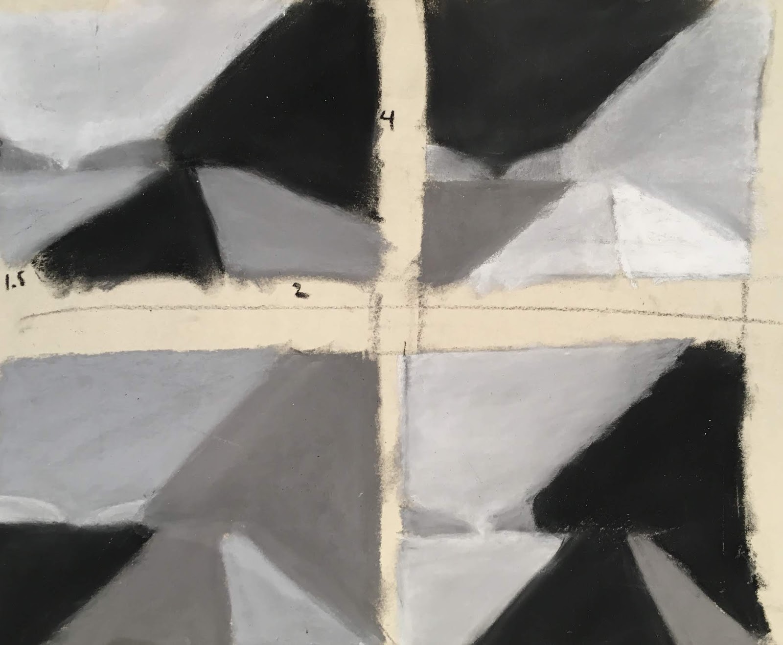
After our last class, I found myself making some more stencils in my studio after class, then I wanted to play with them, so I got out a canvas and began creating a painting using the stencils and fluid acrylics.  I'd been wanting to paint the image for a while and woke up knowing this was the right way to do it.  I wasn't collaging the paper onto the canvas. Instead, I used the paint through the stencils directly on the canvas.  Here's the result:

It is so utterly different from anything I've ever done before! I really like how it turned out.  I'd gotten up at 6 AM to have time in the studio before I had to start my day and ended up feeling totally energized by 9 when I had to start the rest of my day.

The next day I finished the first piece all the way then began on a second.  It was going to be another representational piece, but I ended up having so much fun with the patterns and stencils, I left it as is. 

The hosed-down version.
I then began a third piece which isn't finished yet.  It's based on a photograph I took in Iceland of a rusty old door (piece of a boat??) beside the lake in Laugarvatn.  I piled on the paint, then realized it was way too heavy so I took it outside and hosed it down before it dried all the way. 

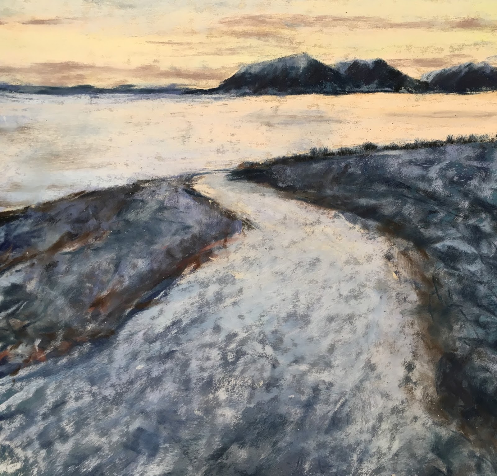
The Rusty Wheel
Acrylic on canvas
24"x 18"
 For the more final version, I left most of the stenciled part washed away, but glazed it with bright color.  I couldn't manage to get the wheel the color I wanted so I collaged paper on it - after all, I'd made reams of paper for just that purpose!  It was fun figuring out how to apply it and make that work.  For the left hand side, I created a few templates with irregular circles on it and used those to create the stones.  This piece is almost, but not quite finished.  Looking at it again today after a week of not seeing it helps me see some places I'd like to work on.

When I left for the workshop Friday, I was so excited about what I was doing with these canvases, I couldn't quite imagine focusing on pastels again. Now that I'm all excited about pastels, it's hard to know what to do with all the acrylics and canvases I just bought!

Am I fickle or what??!  So much fun to be had in the world!  I am one lucky woman!


Loosen Up! Workshop with Marla Baggetta

As soon as I saw the title, I knew this was the right workshop for me!  "Loosen Up!" it was called.  And it worked - at least for the duration of the weekend.  The jury's out whether or not the change will be somewhat lasting.

Marla Baggetta was brought to Richmond by the MidAtlantic Pastel Society, MAPS, a group anyone with interest may join (I highly recommend it!)  Marla was an excellent teacher - fun, enthusiastic, caring, knowledgeable, with a whole stack of interesting and challenging exercises which really got her point across.  Interestingly, she taught the very same concepts I teach in my Intro to Pastels class, but she had different exercises to get the point across, more advanced ones.

One of the first exercises we did was to draw an apple.  I have my students draw apples as well, so it's an exercise I've done probably 200 times.  It was fun to see her approach and to modify mine accordingly.  She drew her larger and used much lighter, larger strokes than I do, not necessarily rounded to show the form of the fruit. I encourage my students to use strokes that go around the apple to help give a sense of form and volume.  She also barely looked at the apple, just making up a lot of it including the light source.  It was fun watching her delight in creating.  She really loves to draw!  I loved seeing that!

I drew four apples because I wanted to keep testing myself to do something new - a new view of the apple, using completely different colors and values - anything to test myself. The first one is fairly normal. These are about 9"x 12".
   
Very frowsy edges!


The bottom of the apple. Very intense colors.
Marla suggested that I got a bit heavy-handed
with the pastel so I tried again!
The fourth and final apple, also upside
down.  (Chris thought it was a picture of
mountains and sky.) More muted colors.


My favorite exercise had us consider composition and the values found in a given composition. We were to analyze the composition and break it up into 3-5 values, then draw that thumbnail according to Carlson's Theory of Angles/Planes (The link is to Marla's video explaining the theory in more detail than I have here.) which says that the values of elements in the landscape ascend from lightest to darkest in the following order: 

  1. arch of sky - lightest, source of light
  2. ground plane (except water which may reflect the sky and be equally light)
  3. angled planes (like mountains)
  4. uprights - trees, etc.

Once we drew our thumbnail according to this theory, we were to mix up the values and draw the thumbnail three more times using different values for each portion.

Once done, we were to use different color schemes to draw the thumbnail:
  1. B&W&gray
  2. realistic
  3. saturated (intense colors)
  4. neutral
  5. tints
  6. shades

After this lesson, Marla showed us a composition she had created out of thin air which she has drawn hundreds upon hundreds of times using these ideas.  She did a demo to show us how she goes about using these ideas and incorporating them into a painting.  Then she challenged us to use the exact same composition and our own color/value/intensity choices to create a piece.  I did two.


 At first, I did everything in this image bright bright bright.  She came over and commented that when everything is bright, nothing is, and encouraged me to dull some portions down.  Thus the darker/duller foreground and duller sky up top.

I thought of Spring colors when creating this one. I haven't sorted out the difference between "loose" and "fast" - too much programming from my youth, I suppose, when "fast" and "loose" were synonymous for girls!  Anyway, I did both of these very very quickly. I'd like to learn to work more slowly and thoughtfully AND loosely.  I like the strokes here and the colors.  I think I could have made it a bit stronger if I'd given it more thought as I went along. I will say, though, it was very fun tumbling along around the page, throwing colors at it without a photo reference.  Very freeing!

Our next exercise was to use our own photograph, the one we had made the thumbnail for and worked with extensively.  Here's the way my thumbnail developed (we were asked to create a vertical, a horizontal, and a square thumbnail for the image, but I only did horizontal and square (the third image is for a different image I hope to work on tomorrow):


That turned into the B&W and grey images show first in this blog post.

My first attempt at drawing this image wasn't as successful as I'd hoped: (oh! It feels so vulnerable to share this and to share my efforts.  It seems so much safer to share just my final outcome after I'd done it three times!)
I like the water and sky, but the mistake I made was to try to draw the vertical trees AFTER the sky was in.  It isn't possible to get the trunks dark enough.  Marla came around and suggested I draw the tree trunks before drawing the sky then drawing the sky around the trunks and branches.  I'd thought that would look weird and not so good, but she showed me how she does it, and I can see that it works.  So here's the second attempt:

I feel like the foliage in the trees on the right is a bit heavy-handed so I decided to try it again, this time as a square composition:

I feel like I manage to convey the sense of the rising sun better in this one, and the foliage on the right is effective.  I also like the light on the road.  However, the brush on the left is too high, darn it.  I do, however, like that I used lots of colors in the brush and trees, making it much more interesting.  I will try it one more time tomorrow to see if I can nail this puppy!  I'm not sure why it matters so much to me - I guess I just want to learn how to create a scene like this.  It's difficult! I won't learn it unless I keep practicing. Stay tuned!

The third day we had the opportunity to draw some pictures on our own using the information we'd learned the previous two days.  I worked on one piece from Iceland, one from the James River. I did thumbnails of several images then chose these two as the most successful to try.  There are a couple more I hope to draw this week when I get enough time to play again.


Rounding the Bend, Hrisey

Man and Nature
Huguenot Bridge from Huguenot Flatwater

The last exercise Marla challenged us with was to take the largest piece of paper we brought with us (mine was 19"x24") and to draw a single object from around the room on it, loose, fun.  I almost got finished before the critique started!


I'm so glad I took this workshop. It was great being with a group of pastelists who are serious about their craft and already are quite skilled.  And working with Marla was a true gift. I feel like I learned a lot which I will use in my work from here on out - now, finally - maybe! - I can loosen up and let the energy I'm feeling come through more clearly!

Friday, April 19, 2019

After the 100 Days were Gone By

Left with the void from having completed 100 Creations in 100 Days, I wasn't sure what to do. For about a nanosecond! As soon as I gave myself a chance to wonder, I knew I wanted to paint a pastel painting from Iceland.

My husband and I have just bought plane tickets for Iceland for October.  He'll be there a week. I'll be staying about 35 days, doing another Artist's Residency. I just don't want to stay away from this beautiful country!

We will be in Laugarvatn at Gullkistan Residency, one we have both done before. Laugarvatn is a beautiful small town on the Golden Circle (between Thingvellir and Geysir). There's a gorgeous lake with fabulous clouds scudding across the sky in front of the plate glass windows of the residency's studios. There is a large hotel where I've taken my travelers on our tours and a hostel. Three schools. Some good restaurants. A terrible grocery store that's more like a convenience store. A luxury spa. A swimming pool with practically the same facilities but only $5, not $35. And a lake - did I mention the lake? - to walk down to daily and wander around. And a mountain with trails behind the residency to climb and explore.  It's a compact paradise near many wonderful sights. I am very excited about returning yet again.  I feel so blessed!

So I looked through my photographs of Iceland, ones I'd stored in the special folder on my desktop marked "Paint these", and chose one from a day in Akureyri.  I'd needed to get away from the hustle and bustle of the city so I drove south down the fjord, away from town. Across the fjord I was startled by the contrast between the bright white mountains and the crystal blue sky. With the gentle half moon perched gracefully near the floating white clouds. It's now a painting on my easel where I look daily with longing, anticipating a return to this land I love so much!

Half Moon
pastel
24"x18"
$650


Monday, April 15, 2019

#97 - #102!!! I did it! I reached my goal of 100 pieces in 100 Days!

#96
This is another piece from when I was playing with aboriginal motifs. I really enjoy drawing with dots to create fluid movement or form or volume. It's surprising what they can do. The only problem with it is that drawing the dots or the small lines causes my hands to hurt more than I can tolerate. My massage therapist felt my hand after creating my pregnant nude (a 3-4 day process) and was stunned at how large and hard my hand felt.  And it HURT!  I went to bed in pain. Darn it! I don't know if there's a better way to do the dots and lines or not. I watched an aboriginal woman paint (leaves, not dots) and her lines were incredibly fluid and easeful.  I have a lot to learn before I can do that!


#97
In my Intermediate Drawing class the other day, I brought in some dogwood flowers and asked the students to draw them in as many different ways they could imagine, using lots of different materials.  I decided to take my own challenge.  #97 and #98 were my results. I find it helpful to challenge myself to draw the same thing many times - it kicks me out of my ingrained habits and ways of doing things and helps force me to have new ideas. The pencil drawing is my typical way of drawing a flower. It's what I know best (other than pastel) and gives me the most control.  The small black square-ish is done with a Sharpie marker and pencil. It was very different working smaller an trying to fit the flower into the small box. I faced the flower a different way as well, so it probably isn't as legible as a dogwood blossom. For that reason, it makes me a bit uncomfortable, but I also find it an interesting graphic. Overall, I like it more than I don't.

#98
#98. First I drew the flower in ink, lying face down on the table. I used the method of Modified Blind Contour Drawing, so mostly I wasn't looking at the paper as I drew, just at the flower (though I peeked enough to get it mostly accurate). Then I drew charcoal all over the paper and used my eraser to draw the larger flower in, right over top of the smaller flower. I used to never layer things. I wouldn't have put two different drawings on the same page. Now I don't really care. I didn't pay attention to the first flower when I drew the second. They end up interacting with each other. If I'd been more intentional about it, I would have changed the composition, but this one makes me think and work with it and try to decide if I like it or not, or what I could/should have done better. It's good to try new stuff. I never know if I'll end up liking something or not.

#99
Wysteria Vine from the Discomfort
Workshop


Yesterday I was beginning to panic a little bit because April 15 was rapidly approaching, and I didn't have any idea of how many pieces I had done and whether I was close to 100 or not.  To that end, I began playing in my visual journal, combining elements I'd been saving for a while. This picture has images from a flower catalog, a quote, and some paper I made Thursday morning.  That's another story...

I teach a group of women who've been working with me for about two and a half years now.  We began by having me teach them Zentangles. After a while, I got tired of Zentangles and wanted to expand what we did, so I began teaching them some elements of design and about color. Since that time, we have explored so much! We've researched artists and created artwork a la Artists XYZ. We will soon be starting on a series of women artists and their contributions over the centuries and today.

One of the women in the group is the one who loves to buy art supplies and brought me the Brusho to try out. She also provided a book by Elizabeth St. Hilaire who creates colorful papers using acrylics on rice paper, then tears up the paper to create collages. This students, Barbara, wanted to learn how to do it, and was thinking about going to Florida to take a workshop with the woman, but I told her, after looking at the book, that I thought I could figure out most of it.  So Thursday, we created part one of 8 of my version of St. Helaire's workshop!

We hauled 7 folding tables into my yard, covered them with plastic, then pulled out paints, water, cups, things with which to make textures, paintbrushes, stencils, and about 30 other fun things with which to paint/mark/scrape/etc. and for 4 hours proceeded to cover rice paper with as much paint and as many textures as we could muster.  It was a great deal of fun, and we came up with some really interesting papers.  Though we are meant to hold on to them to use for collaging, I have used a couple in my Visual Journal already today. In #100, the white paper is one of the sheets I made that day.  I used paint on corrugated cardboard along with some bubble wrap to create the textures you can see.  The green is simply brush strokes. I think it'll be fun to see what other papers we come up with and what we end up doing with it.  It's an interesting process to learn an to go wild with!
#100
#101
#101 is a collage out of many disparate elements. The card is an advertisement for a book of poetry published here in Richmond by a woman named Hope Whitby. 

#102
#102 is more flower catalog images along with a blind contour drawing.

AND - I CAN'T BELIEVE IT!! With this blog post I am finished with my 100 Creations in 100 Days! Warts and all!  And 2 days early. Wow.  Tomorrow I will take some time to reflect on how this feels and what I've learned from the whole process, but for now I need to go to bed. It's after 1 AM and I gotta get some sleep!

Thank you for taking the time to read my blog. I'm deeply honored that you have spent your time with me. If you feel like leaving comments, I always welcome them (as long as they're nice!)

Good night!


Saturday, April 13, 2019

#95: My student asked, so I figured, Why not? Experimenting with Brusho

In March, one of my students who LOVES to buy art supplies, brought me some Brusho and asked me to play with it then show her how to use it.  I'd never heard of it so I did a little bit of research and began experimenting, using the beautiful jonquils just then blooming in our yard as my subject.

Brusho is a powder that comes in small containers. You're supposed to poke a hole into the top of the container so you can shake the powder out to put it on paper.  It's highly concentrated and very intense, so not much is needed.  It can be applied dry to dry paper which you then spray with water, or dry onto wet paper where it spreads on its own.  It spreads more or less, depending on how wet the paper is.  The first picture was done to give me a chance to understand a bit about how the Brusho reacts in general.  I discovered quickly that the colors are vibrant to the point of glaring. I like a bit more subtlety in my colors.

Below you can see the small jars of pigment and the start of a drawing.  I used pencil to draw the jonquils onto watercolor paper then wet the paper and sprinkled the appropriate color Brusho into the various areas.

 I then re-drew my drawing using a Micron 01 pen, a waterproof, very thin-line, permanent marker, to re-establish the flowers and foliage.
 I decided to try to deepen the background to make the jonquils stand out more, but decided it was too much. I didn't like the mess I'd made so I cut out the flowers and put them on a black background.
I wasn't so crazy about that either - the contrast was too stark - so I put it on a very different, weird background - the red and tan striped paper. I painted a plastic cup around the flowers and splashed a bit more Brusho around the flowers and called it done.


#95
Spring Flowers
Brusho, watercolor, collage, multimedia

#89 - #94: Visual Journal meanderings

Before leaving for Paris March 22, I was experimenting with lots of patterns in my Visual Journal.  Some of the designs I saw on Pinterest, some in a book about Aboriginal artists, some I made up. Inspiration comes from so many different places.

What I love about my Visual Journal is that it's my place to experiment.  I choose to ask myself, "I wonder what would happen if I...?" then I proceed to find out. Sometimes the results are wonderful, and I'm really happy. Other times I feel disappointed and feel like maybe I wasted my time - though I also realize that isn't true - I'm learning something at all times if I just pay attention to the lesson!

This first drawing gave me the idea to create the pregnant nude drawing using these same types of strokes to indicate the curves of her breasts and belly. The second drawing gave me more ideas about the roundness of her body and how to represent it.  (I've written about that drawing here.)


#90
#89

These drawings were created through the following process: First I painted the white paper with brightly colored, jewel-toned watercolors. After it dried completely (that part is important!), I put tape down where I wanted the paint to show. Then I painted the piece with black gesso. After it dried completely (again, completely is the operative word here!), I pulled up the paint to reveal the beautiful "frame".  Then I created the white-lined designed.

The piece on the left, I think, is less successful than the one on the right, primarily because I didn't follow my own advice and wait completely until the watercolor dried, or until the gesso dried! Consequently the watercolor isn't as finely done, and the lines aren't as sharp.  I also used lines to demarcate the regions. I prefer how I did it in the second one - I think it looks cooler! It's helpful to try things more than once to really get the hang of it better!

#91 Version 1
#92 Version 2

#93
"Art is something that makes me breathe with a different kind of happiness."
That seemed worth creating a pretty page for!

#94
I got myself some fancy gel pens and decided
to play with them to see what they were
capable of doing.  I enjoy drawing on black paper with
gel pens as the contrast is so satisfying!

#88: Waiter's Disapproval turns to Waiter's Delight through Art

In Paris, the City of Light, thanks to my friends' predilection for coffee, we spent a fair amount of time sitting in cafe's, watching the people go by, enjoying a rest from all the activity. I don't drink coffee, and I tend to push myself quite a lot and to forget to rest, so sitting in a cafe was different for me! Not bad at all - just different!

After going to a fabulous market near the Bastille our second day in the city, it was definitely time to take a load off our feet, so we went to a crowded cafe nearby. Karen and Gerlinde ordered coffee.  I asked for water. The waiter told me that wouldn't work - I needed to consume something.  I shrugged and figured he just wouldn't bring me anything. I'd sit and enjoy the company. 

A few minutes later, he did bring me water and was fairly nice about it, though he didn't put it down with a flourish.

I took out my sketchpad, watercolors, and brushes, and began to paint the scene in front of me. To my delight, Karen and Gerlinde did the same.  It felt like a dream come true - sitting in a cafe in Paris, sketching the scene before me.  I was tickled to bits!

The cafe had red chairs, red tables, red cups, and we had coincidentally bought red anenomes at the market to put in our apartment to brighten it up. I really enjoyed painting the bright red elements.

The waiter returned about 30 minutes later and saw I was using the water he'd brought to wash my brush out with. Suddenly he was totally delighted! He grinned and mimicked posing and asked me to paint his picture, "The Waiter"! I'd worried he might be pissed I was misusing their glass, so it made me really happy that he was thrilled and played along so well.  It made me think of the days when Paris was the center of the art world and starving artists paid their bills at the cafes and restaurants by drawing pictures on napkins and placemats for the propietors who quasi-supported them. It was very fun being a part of that for a brief fantasy-rich moment!

#88, Waiter's Delight
Watercolor
6"x9"

Paris, City of Light, near sunset.

Sainte Chappele, my favorite building in Paris, in the evening as night falls,
as we prepare to listen to a concert of Baroque setting in the most
beautiful setting imaginable.

Playing with Acrylics and Stencils and Gelli Plates and Rice Paper and... and... and...!

One of the joys of being a teacher is that I get to learn so much from my students... For the last couple of years I've been working w...